 NASA maintains the GISS Surface Temperature Analysis (GISTEMP) data set, and so on a monthly basis there is an update.
What exactly is GISTEMP?
GISTEMP is an estimate of global surface temperature change.
They collect raw data files from NOAA GHCN v3 (meteorological stations), ERSST v4 (ocean areas), and SCAR (Antarctic stations). This is all then combined. They describe exactly how they combine it within a December 2010 publication (Hansen et al. 2010).
Roughly about the middle of each month they then issue an update. This not only includes data that relates to the previous month, but also, when appropriate, incorporates late reports and corrections for earlier months.
We just passed the middle of June, hence the May 2017 data is now available.
The raw data is a table that measures Temperature anomalies – how much warmer or colder it is than normal.
Now that of course opens up an interesting question of what “normal” means. For the GISS analysis, normal is defined as the average over the 30-year period 1951-1980. This is not a universal definition, it is simply a choice made for the GISS dataset.
Does that mean they have fudged the data to yield specific results? No, because regardless of what base period you pick, the trends remain the same.
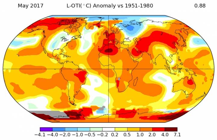
May 2017 – 2nd Warmest May in 137 years of measurements
On 15th June they posted the following update for May 2017 …
May 2017 was the second warmest May in 137 years of modern record-keeping, according to a monthly analysis of global temperatures by scientists at NASA’s Goddard Institute for Space Studies (GISS) in New York.
Last month was 0.88 degrees Celsius warmer than the mean May temperature from 1951-1980. The two top May temperature anomalies have occurred during the past two years. 2016 was the hottest on record, at 0.93 degrees Celsius warmer than the May mean temperature.
May 2017’s temperature was 0.05 degrees Celsius cooler than May 2016. It was just 0.01 degrees Celsius warmer than the third warmest May, which occurred in 2014.
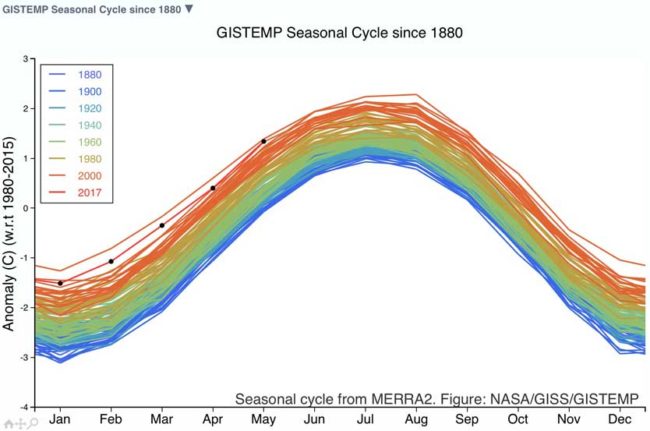
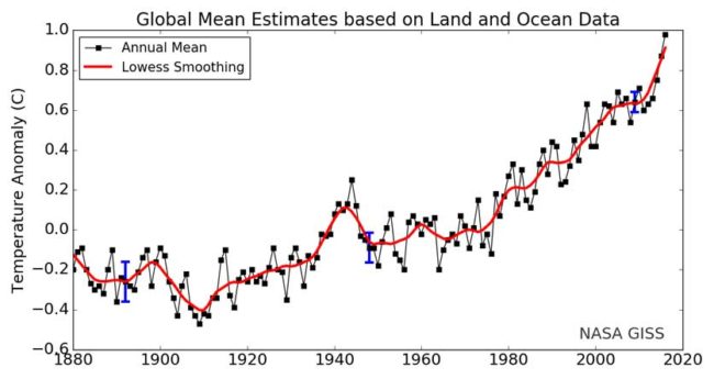
Graphs
Tweets
With May GISTEMP update, my prediction is 2017 will be ~2nd warmest year in the record (<10% of a new record, >98% in top three) pic.twitter.com/tvZ15GMML9
— Gavin Schmidt (@ClimateOfGavin) June 15, 2017